
2024 Color of the year decisions announced!
The time has come for all of the top paint and design-based companies to choose their 2024 color of the year picks. After last year’s more vivid pink and red hues, these new color picks were a welcome change. 2024’s neutral pallet with bluer hues is everything we have been wanting and could not have been announced at a better time. As the holiday season approaches and we get into the winter weather vibes, these rich shades will be sure to please! From deep blues, bright teals, rich greens, and earthy terra cotta, there is something for everyone on this round of picks and I for one cannot wait to get started using them in my decor.
What companies made this sought after roster?
Benjamin Moore paint, Sherwin-Williams, C2, Krylon, Dunn-Edwards, Valspar, Minwax, Behr, Glidden, HGTV Home by Sherwin Williams, Dutch Boy, Pantone, Graham and Brown, Rust-Oleum, Dulux, and Pantone.
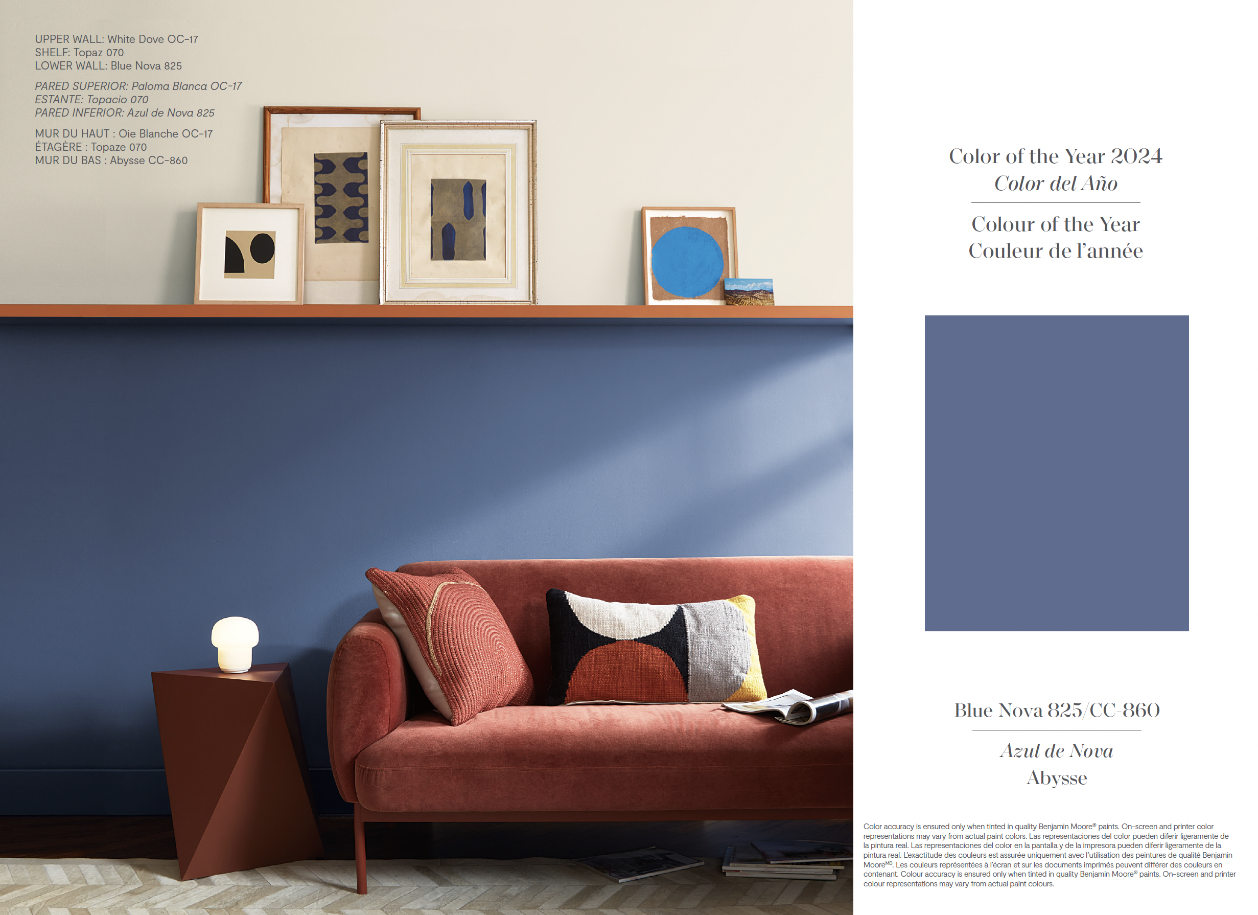
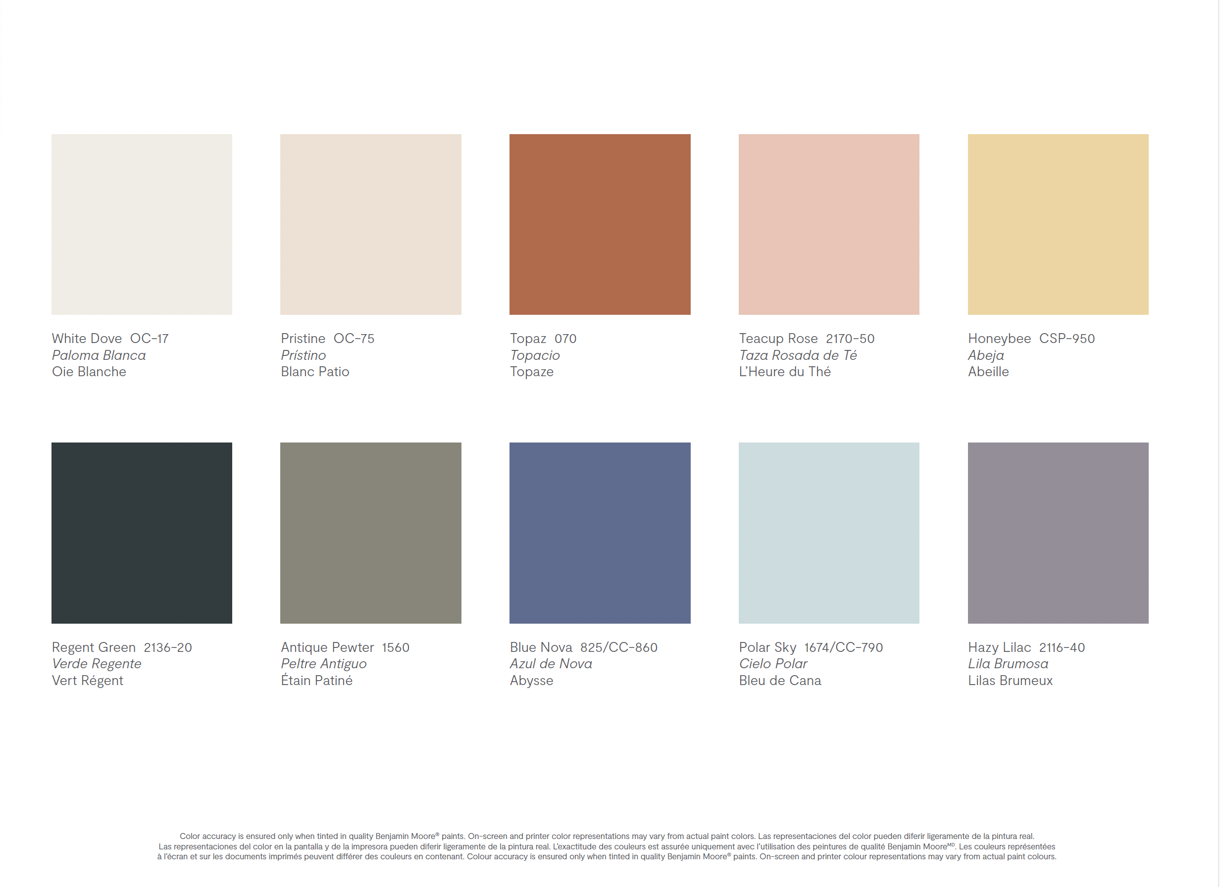
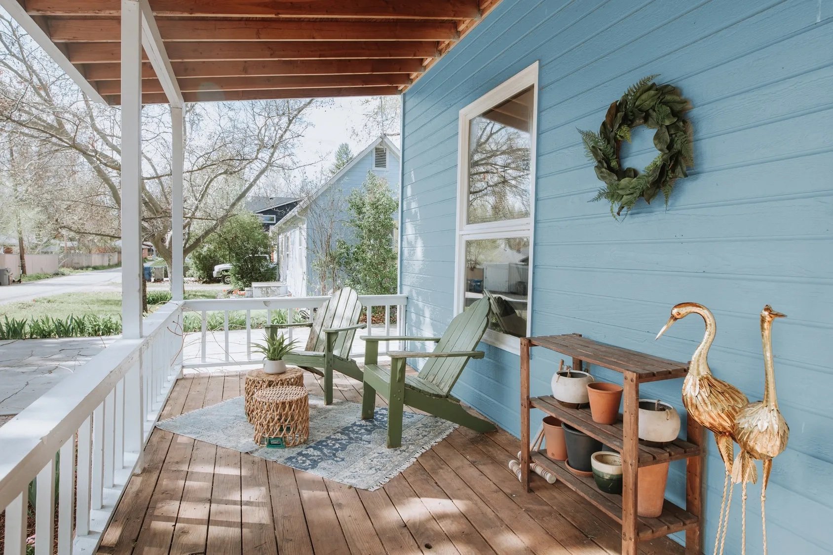
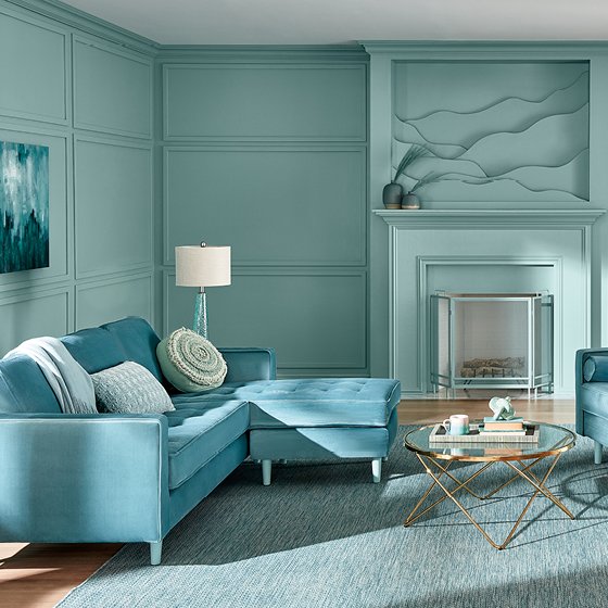
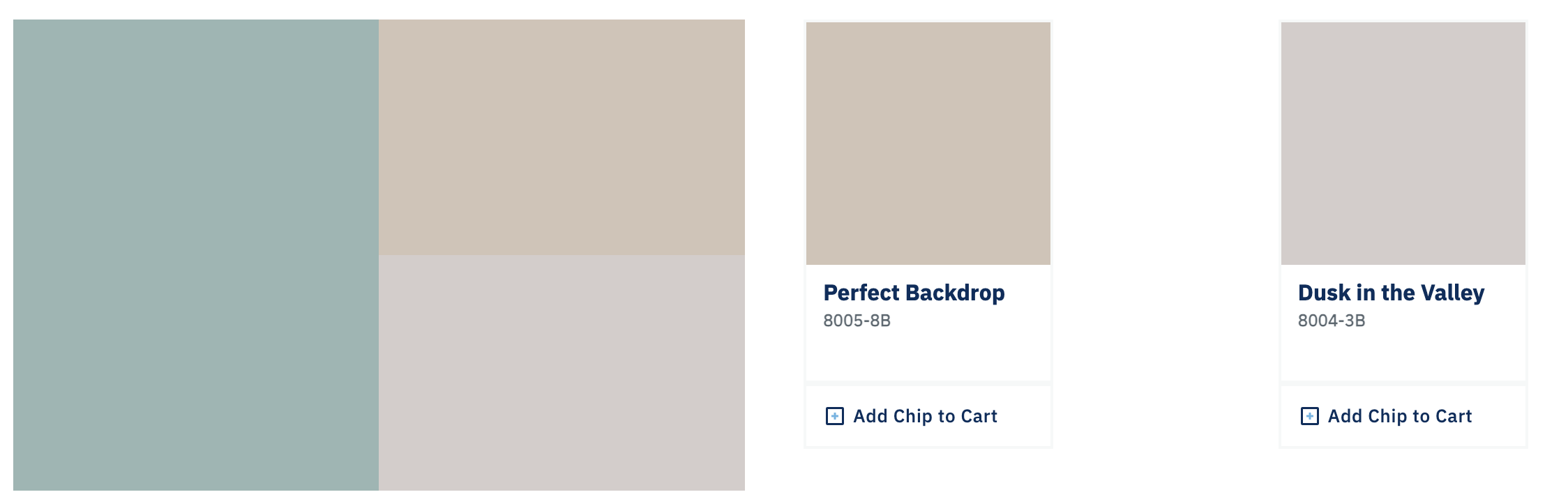
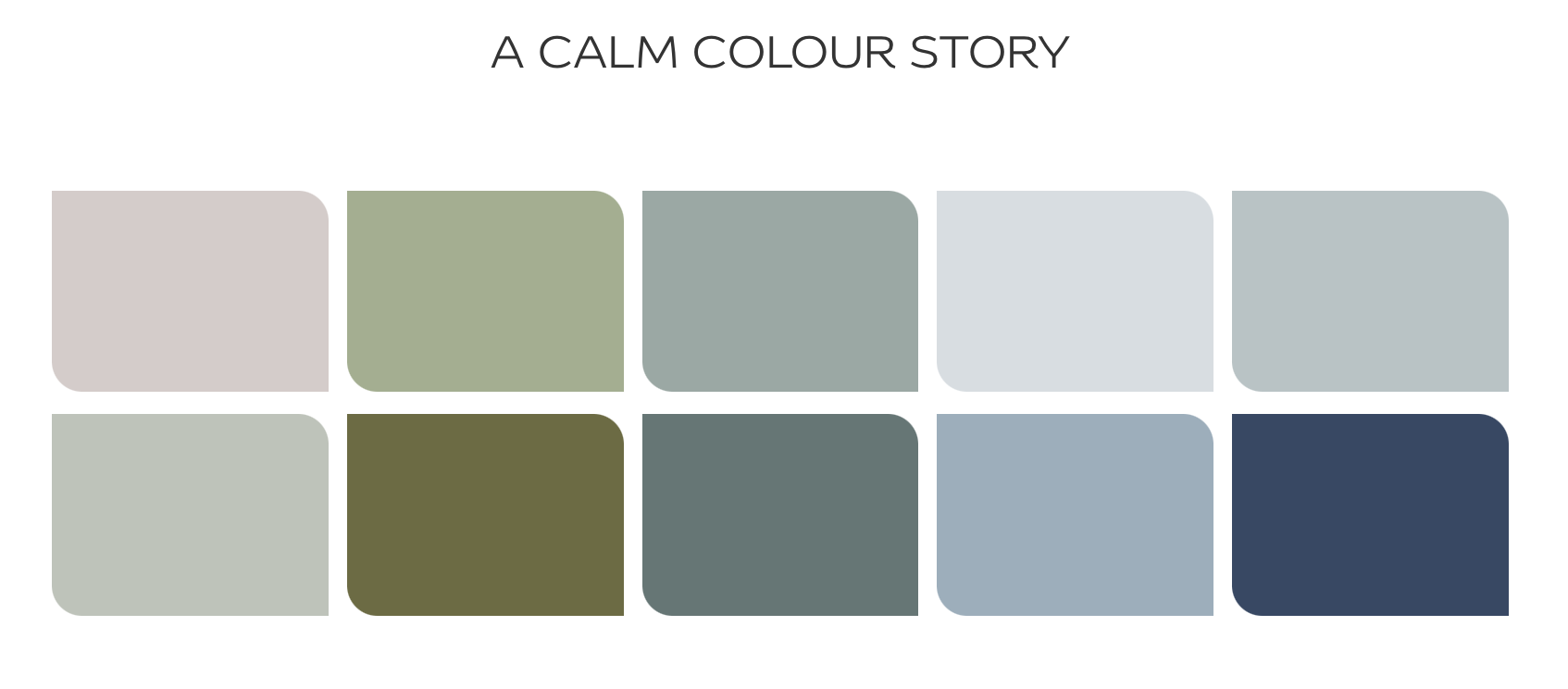
Up first is one of the nation’s top paint brands, Benjamin Moore. Their 2024 color pick is Blue Nova 825.
“Elevate the everyday and expand horizons through juxtaposed color that is sure to inspire. With Blue Nova leading the way, depth and intrigue are balanced by an undercurrent of reassurance. This alluring mid-tone features an enchanting duality, capturing the spotlight with endlessly classic appeal.” - Benjamin Moore.
This particular shade evokes feelings of both calm and elation with its perfect balance of blue and purple. Additional palette colors include White Dove, Pristine, Topaz, Teacup Rose Honeybee, Regent Green, Antique Pewter, Polar Sky and Hazy Lilac.
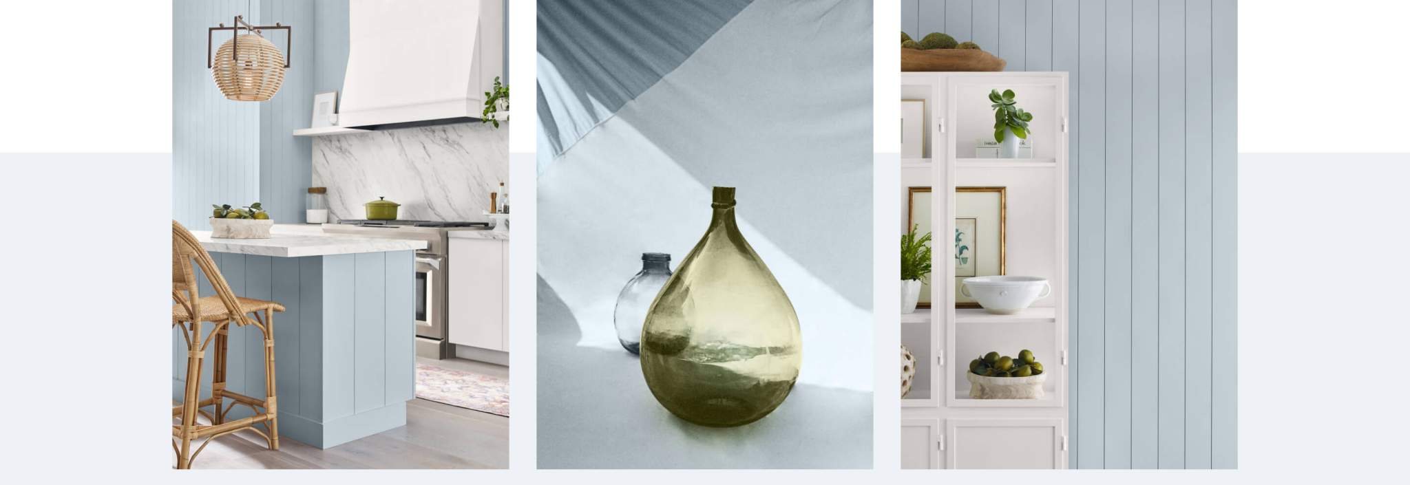
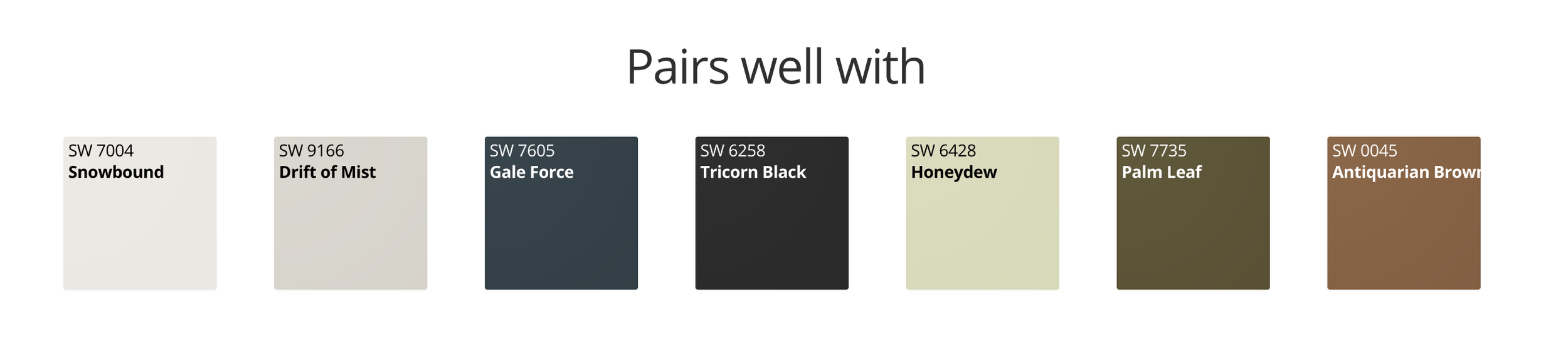
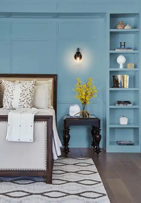
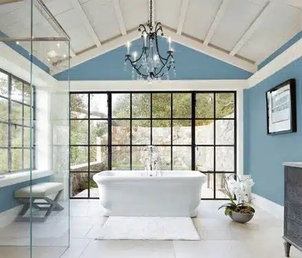
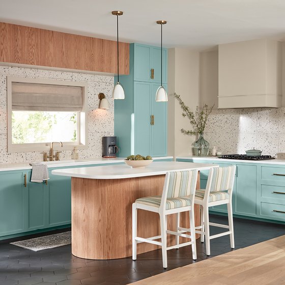
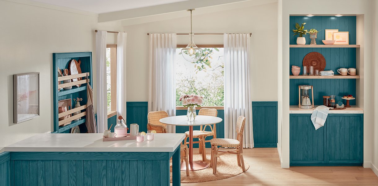
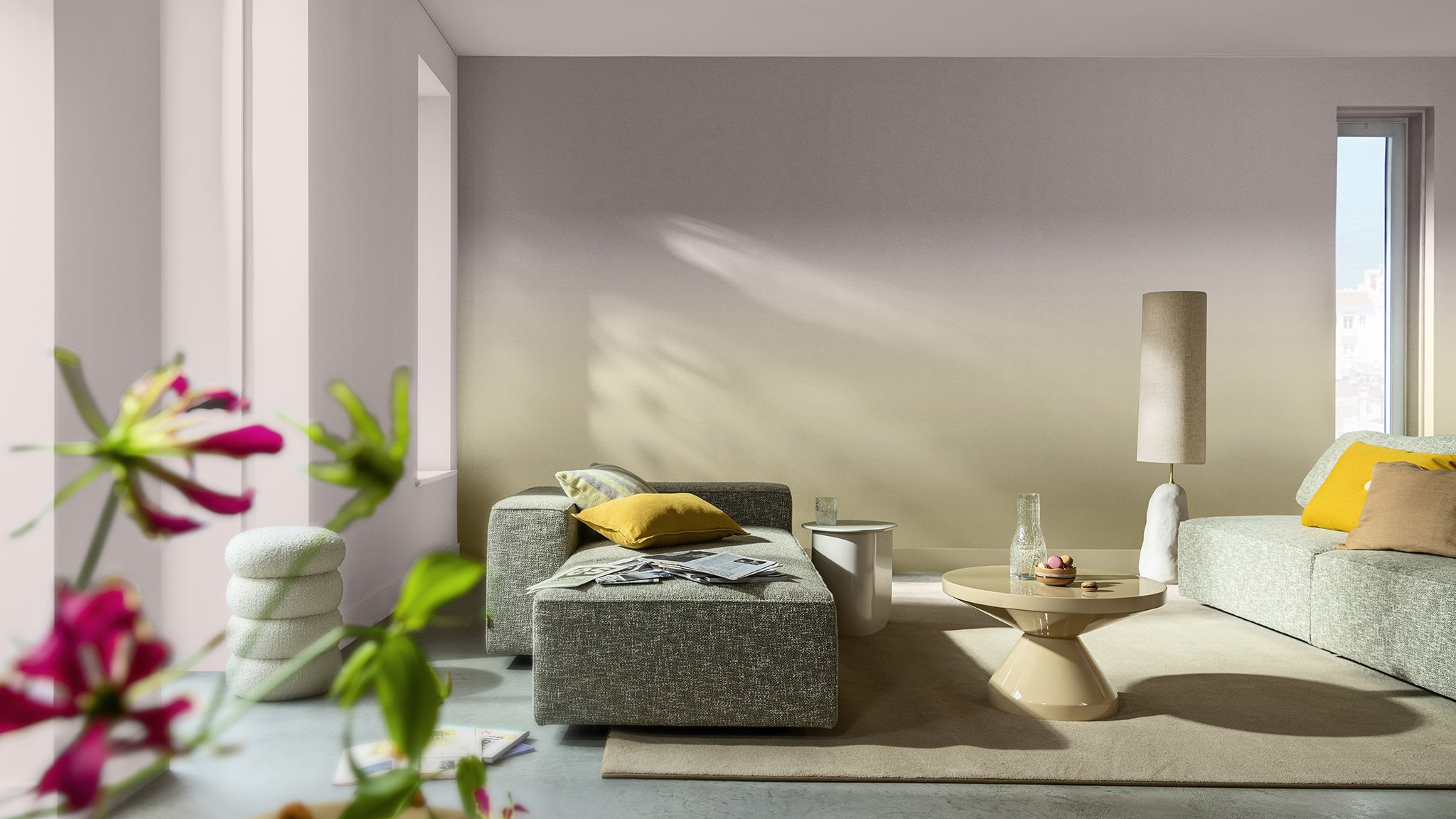
Moving on to the infamous Sherwin-Williams, we are greeted with a coastal pale blue that is reminiscent of a relaxing oasis. Their 2024 pick is called Upward SW 6239. “A sunny-day shade for spaces brimming with positive energy, creative thinking, and total contentment.” - Sherwin-Williams. The palette color pairings consist of Snowbound, Drift of Mist, Gale Force, Tricorn Black, Honeydew, Palm Leaf, and Antiquarian Brown.
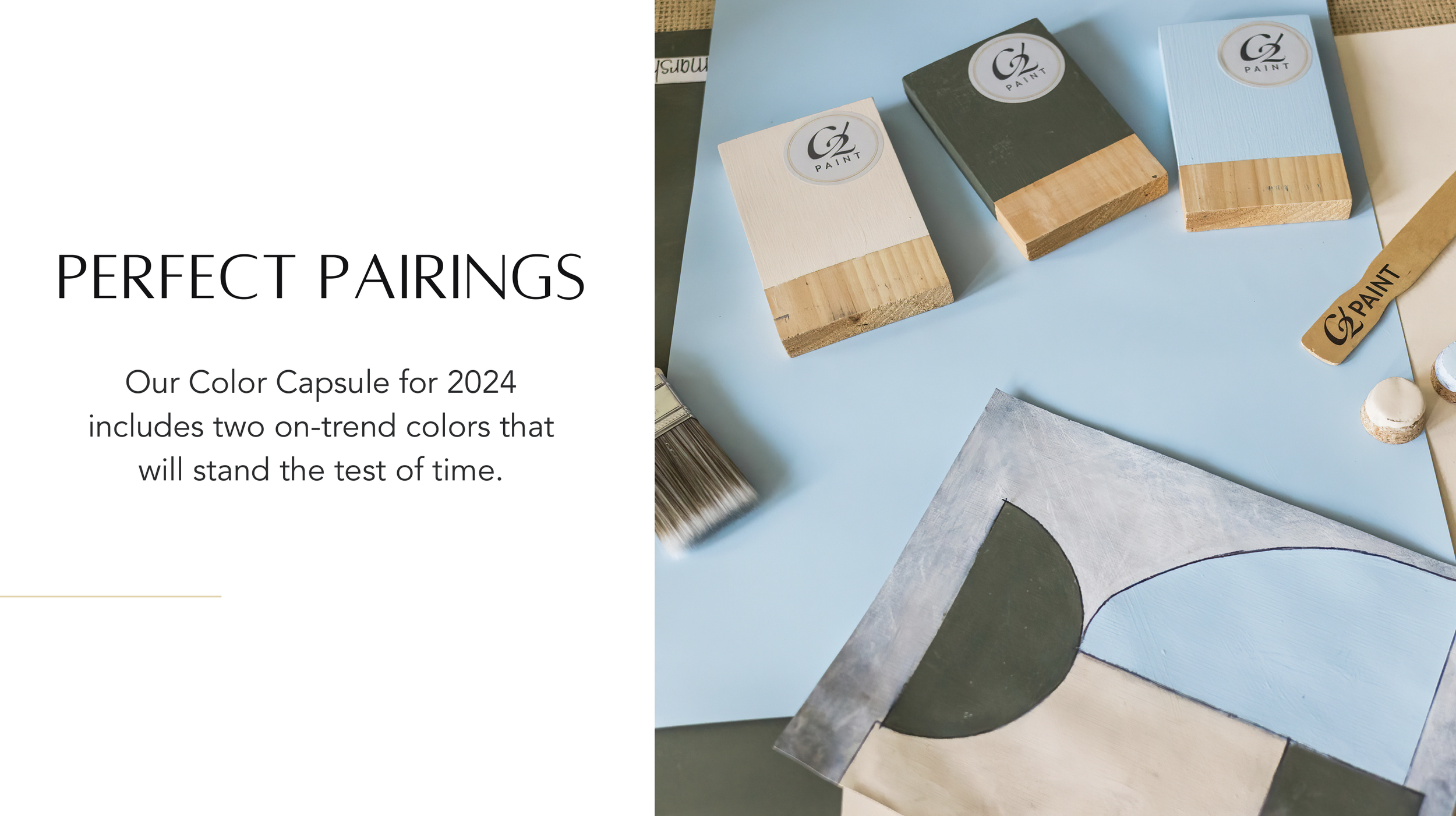
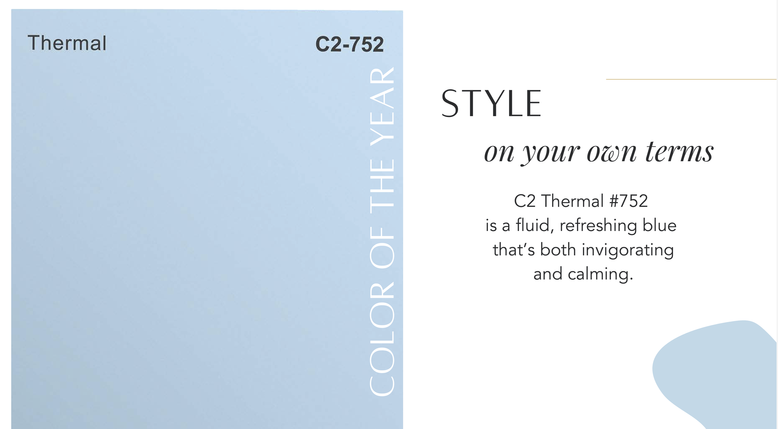
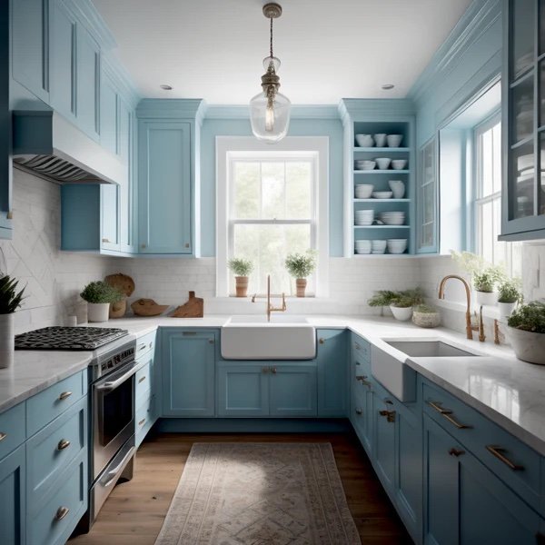
C2 Paint has developed a color that is both exciting and calming called C2 Thermal #752. “‘According to Philippa Radon, Interior Designer and C2 Paint Color Specialist, "C2 Thermal reminds us of a vast blue sky and the infinite array of blue hues nature offers to help restore and redefine our mood. This bespoke pale yet punchy blue is poised for adventure and brimming with hope, evoking feelings of loyalty, trust, and confidence. Its contradictory nature has the dual ability to uplift us and provide a sense of calm and tranquility…’” Included in the complementary palette are Brûlée and Marshland. This timeless yet inspiring pallet is sure to be embraced for its ability to unify a space through eye catching yet calming hues.
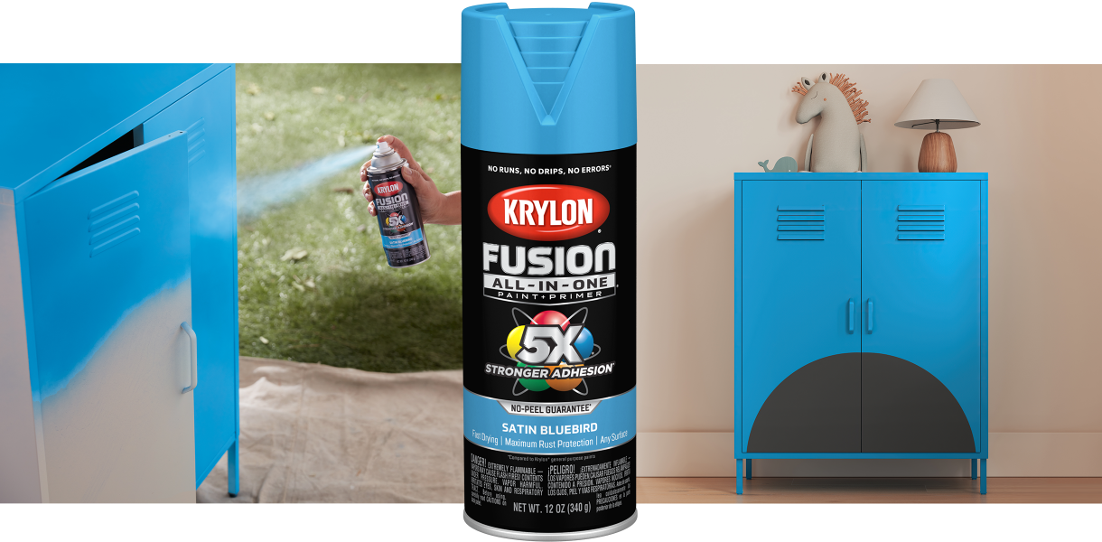
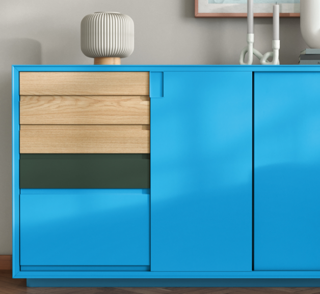
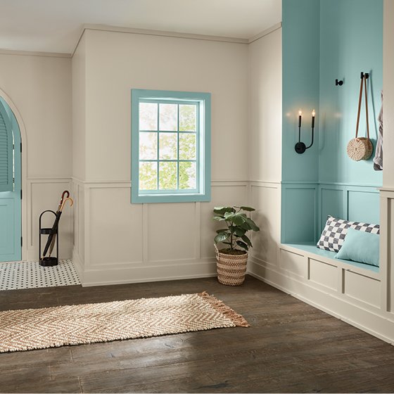
Krylon has announced their bright and chipper shade appropriately named Bluebird which will prove to be a perfect accent color for those more adventurous homeowners. Per Ashley Banbury, Krylon’s Color Marketing Manager, “This bold, yet pale-hued pastel creates a connection with blue spaces like those found in nature, harkening to feelings of floating in soothing ocean waves.”

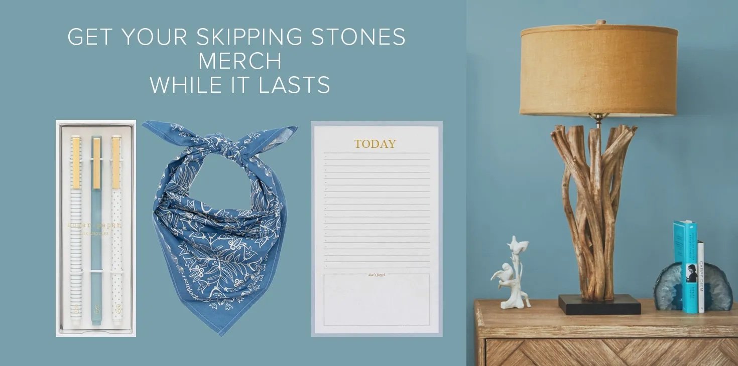
Dunn-Edwards understood the assignment when they released their blue toned water inspired color pick called Skipping Stones (DET567). According to Dunn-Edwards website, this pick was inspired by a “…newfound appreciation for life and all the promise it holds. We cultivate spaces that romanticize the mundane, nourish a softer approach, and merge the magic of nature with the joy of technology… Our search for soothing, introspective moments leads to finding solace in earth inspired hues like Skipping Stones that create spaces for quiet reflection.”
In theme with our blue vibe, Valspar released their color aptly named Renew Blue which is a stunning green tinged blue that evokes a sense of peace and calm and puts the mind at ease. The tone is the perfect color to bring out the depths and dimension of the currently trending decorative wall styles. This color is one I definitely will be incorporating into my own home to create a feeling of stress-free living that we all aspire to.
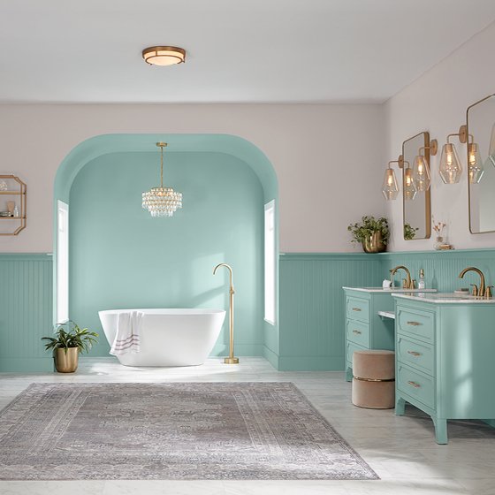
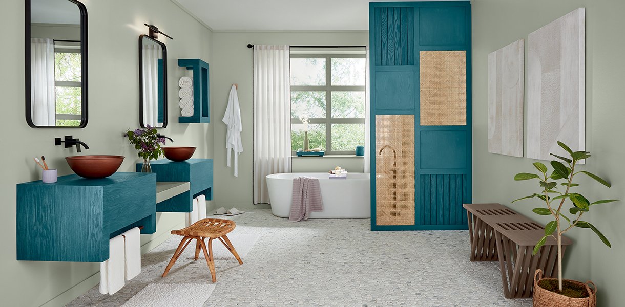
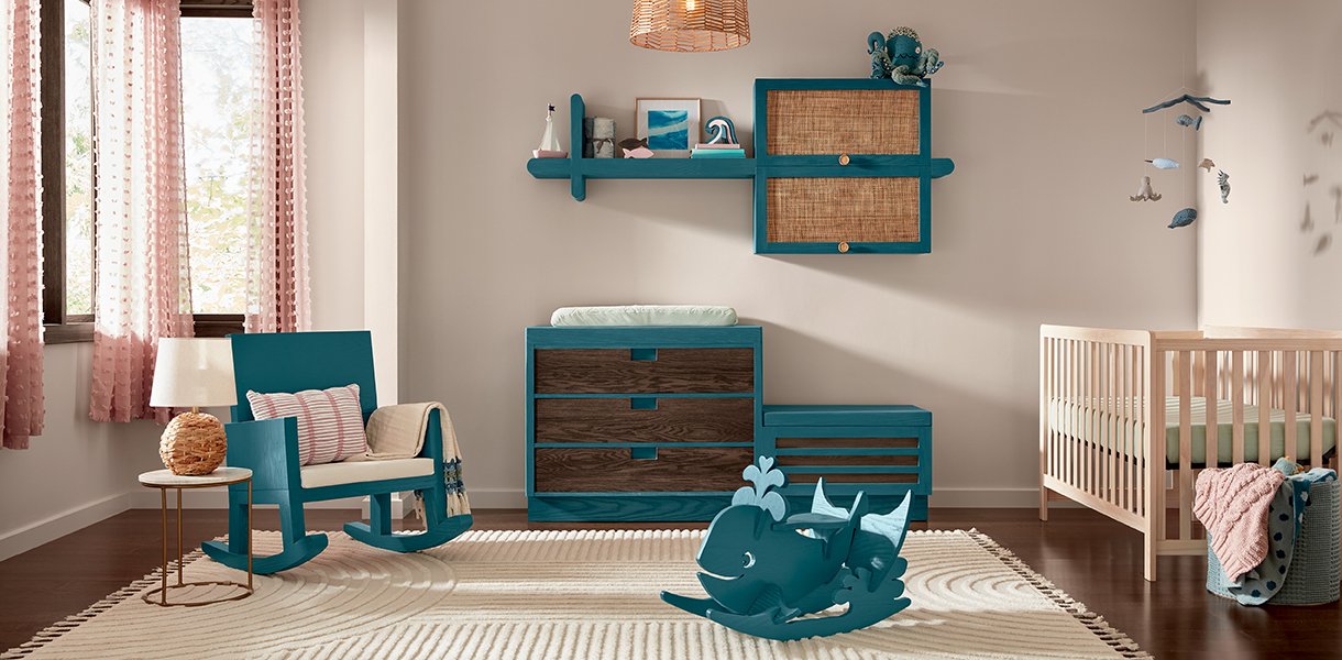
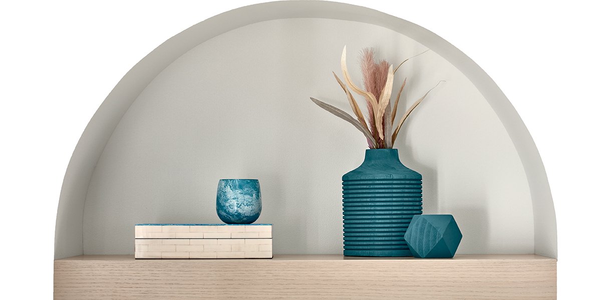
In the words of the great band Eiffel 65, I’m Blue! Minwax came up with a teal blue that is frankly stunning called Bay Blue. “‘By combining the natural and virtual worlds, Bay Blue comforts us while acknowledging the rapid technological changes we’ve experienced for a modern take on luxury. This relaxing mix of blue and green expands our connection to water and wellness, moving beyond the growth-focused greens of recent years for a wholly immersive color experience. It invites you to interpret design anew to create a home that’s authentically personal.’” – Minwax. Bay Blue pairs incredibly well with lighter hues to create a stunning addition to any home that craves new life.
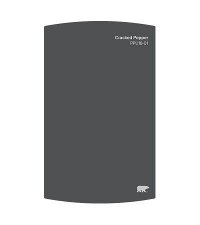
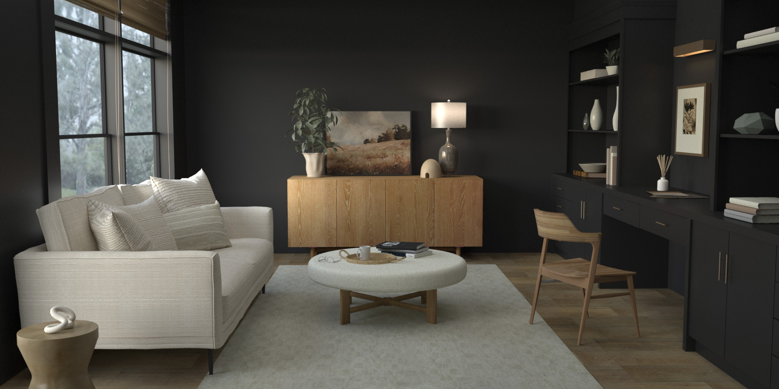
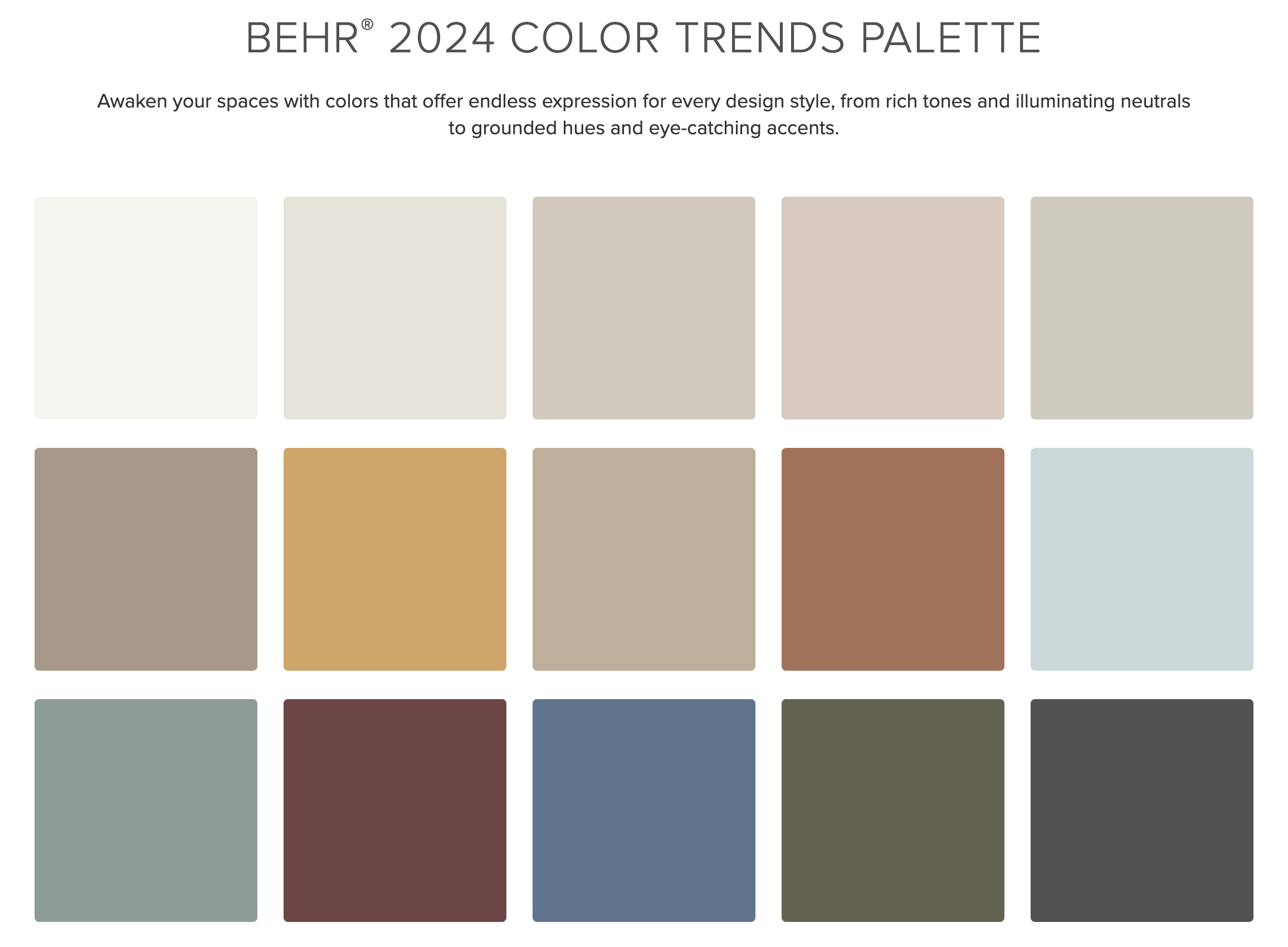
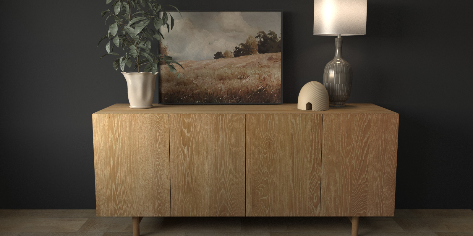
Behr came out in full swing with their bold color choice Cracked Pepper! An incredibly stunning soft black that can be used in almost any space as both an accent and a statement. They clearly came to play with their other palette choices from shades of pastels to rich earth tones.
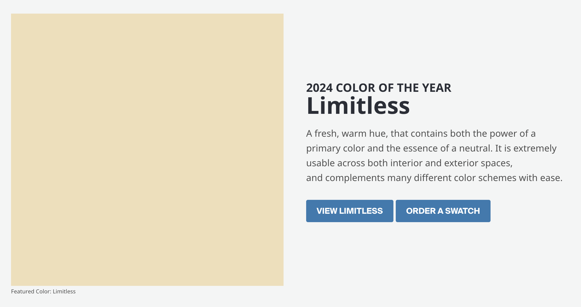
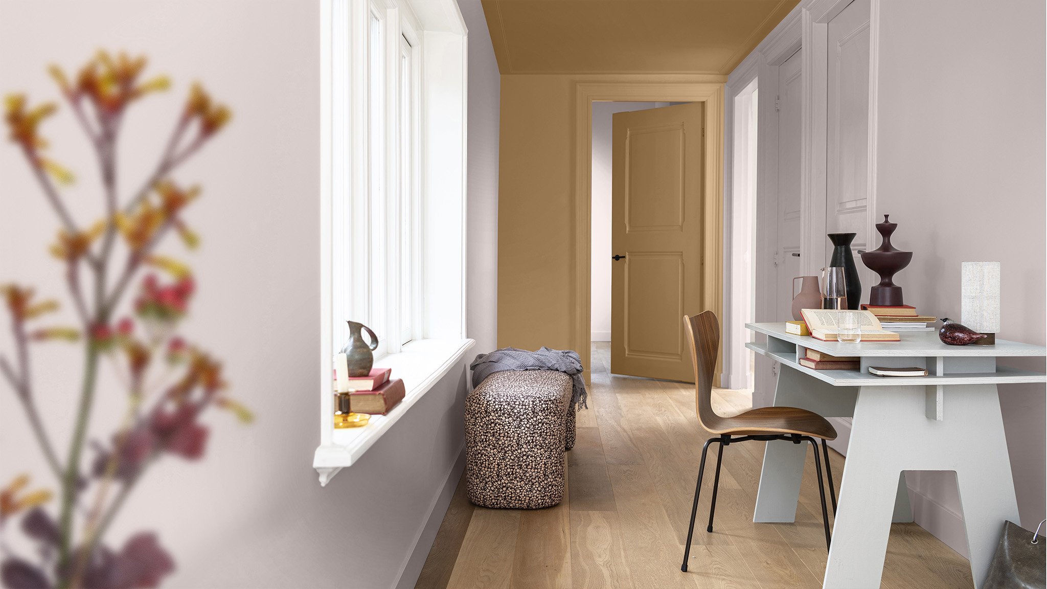
Introducing Limitless, PPG/Glidden’s 2024 color pick that aims to warm up those neutral tones that have been dominating the interior design world as of late. The possibilities are truly limitless with this hue that can complement warm tones, cool tones, or even stand on its own!
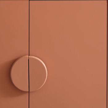
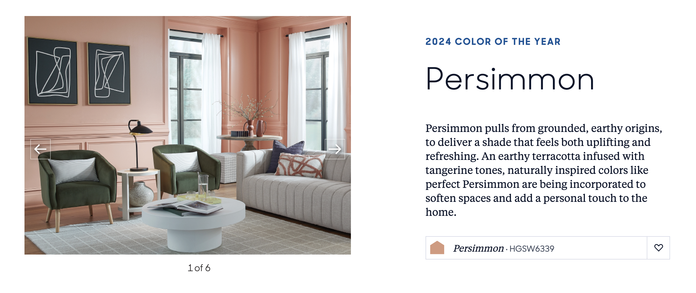
HGTV Home by Sherwin Williams came in with a surprising terracotta shade called Persimmon meant to bring a touch of calm trickled with excitement to any space. The full palette contains earthy tones that evoke comfort and encourage gathering with good friends, close family, or just your perfect fur babies!
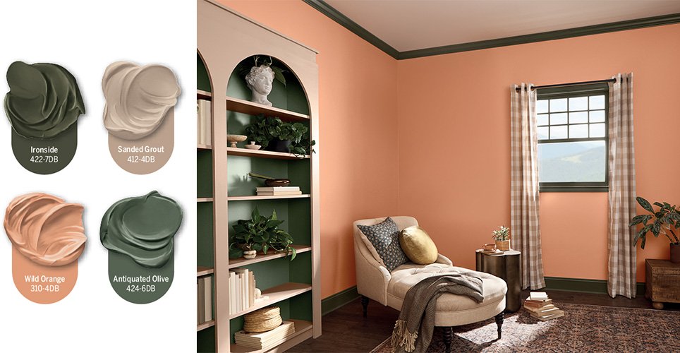
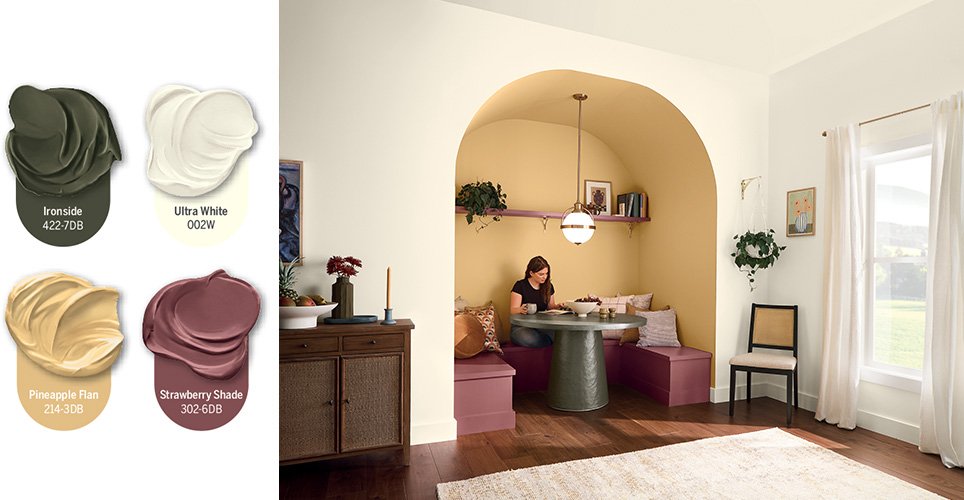
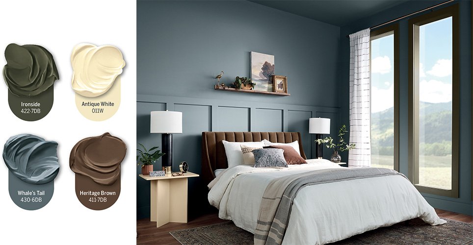
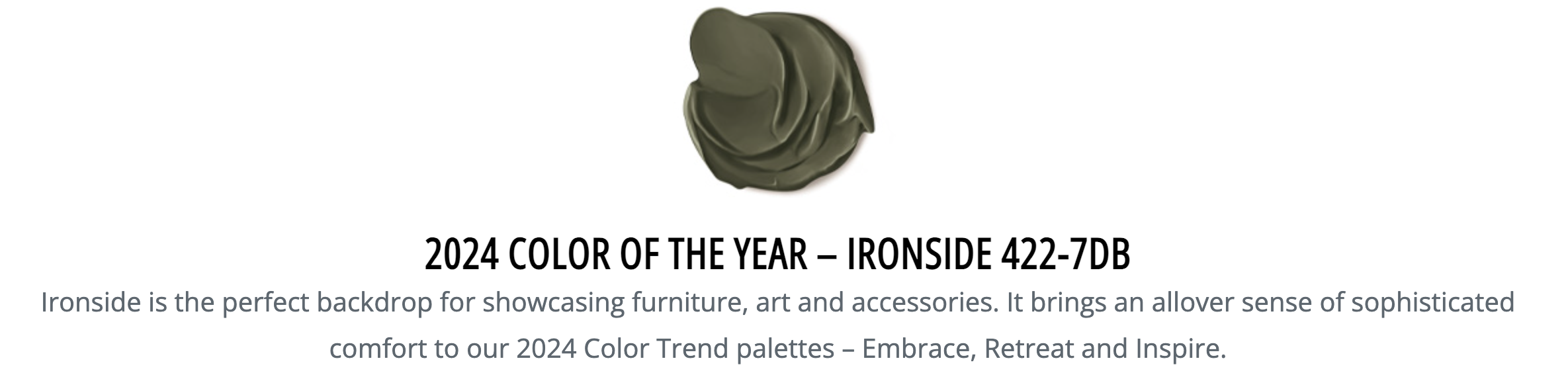
Dutch Boy selected an earthy shade for those with more neutral tastes called Ironside. A comforting green meant to soothe and restore. Ironside is reminiscent of a deep sage tone perfectly accented by a rich and bold palette.
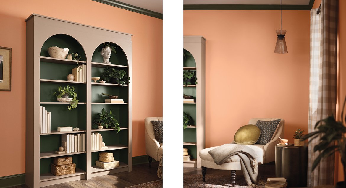
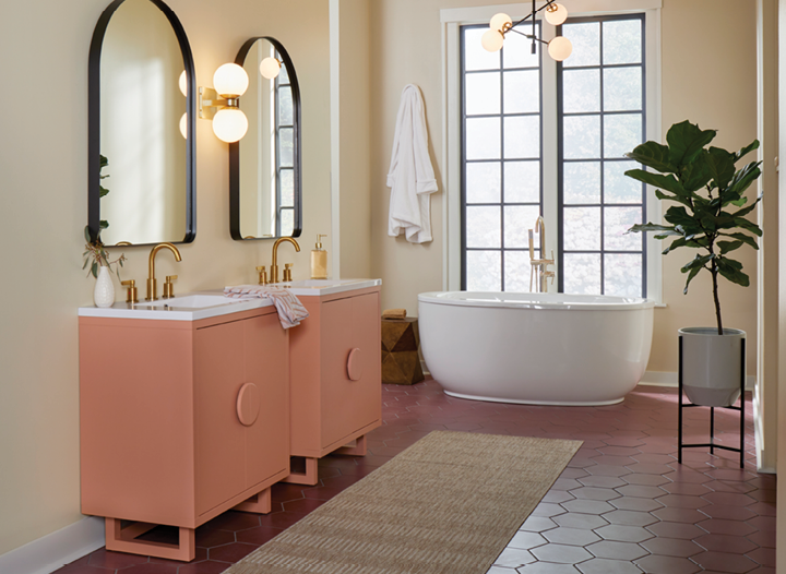
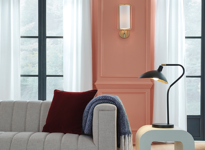
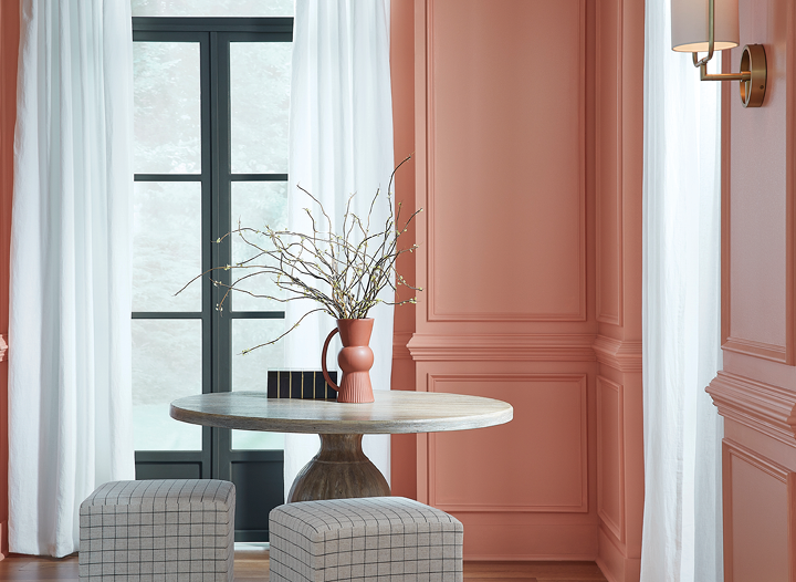
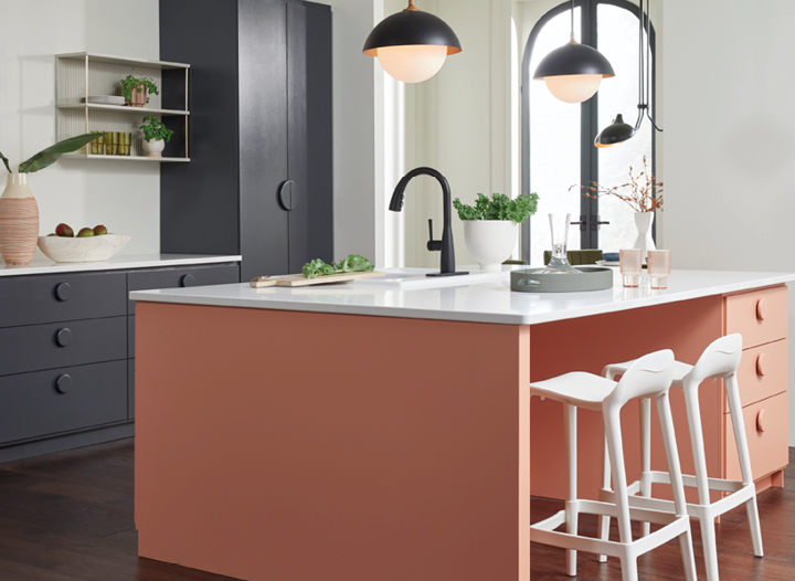
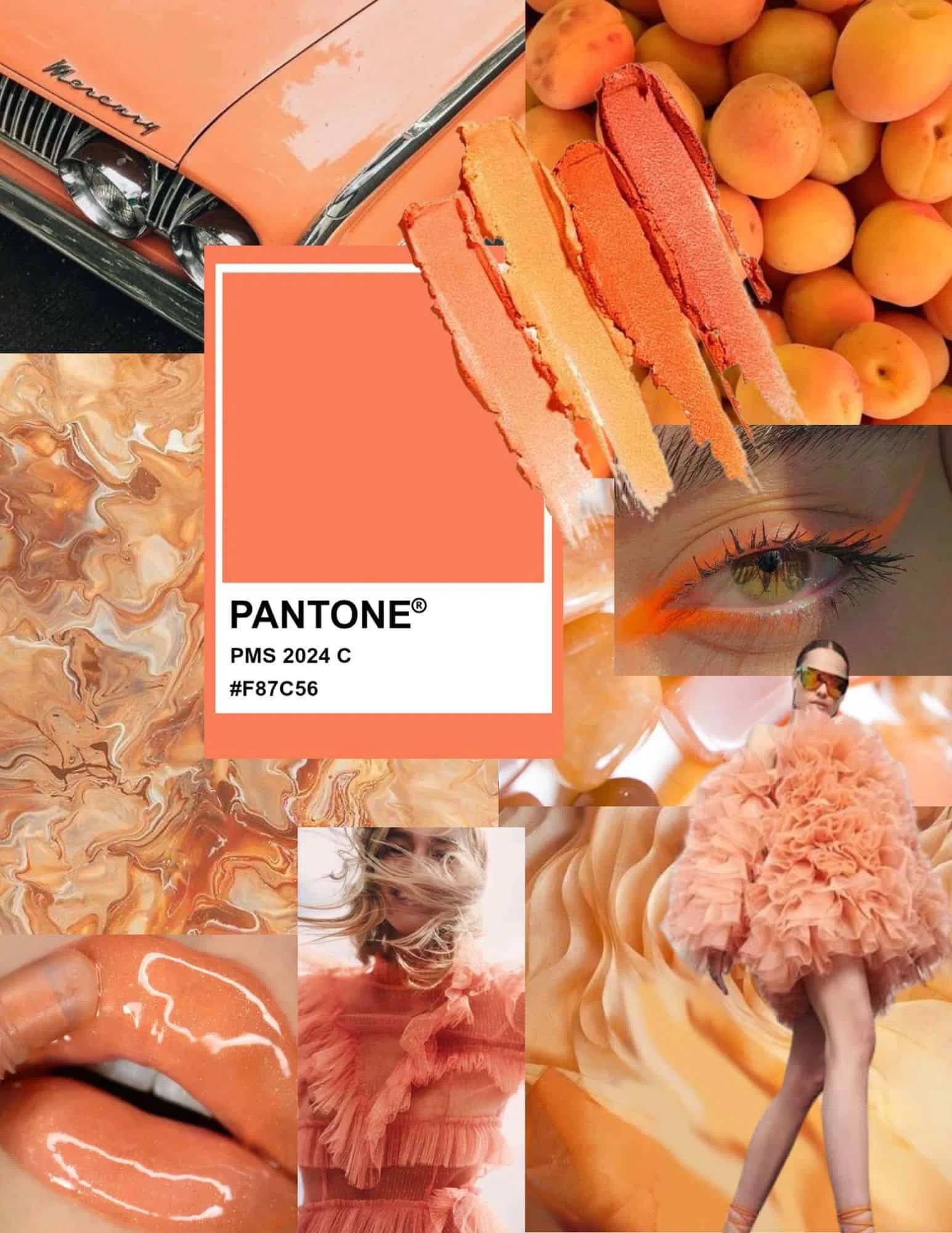
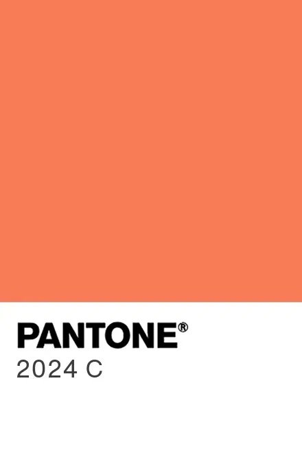
Pantone is ahead of the pack and already looking to the warmer season with their vibrant pick called Apricot Crush (Pantone PMS 2024 C #F87C56). This orange and peach tones shade gives all of the summertime feels for a bright and cheery space sure to create energy and good vibes.

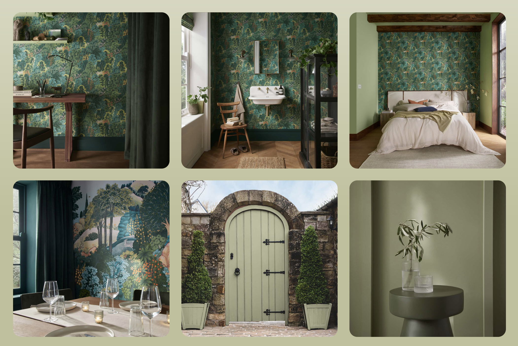
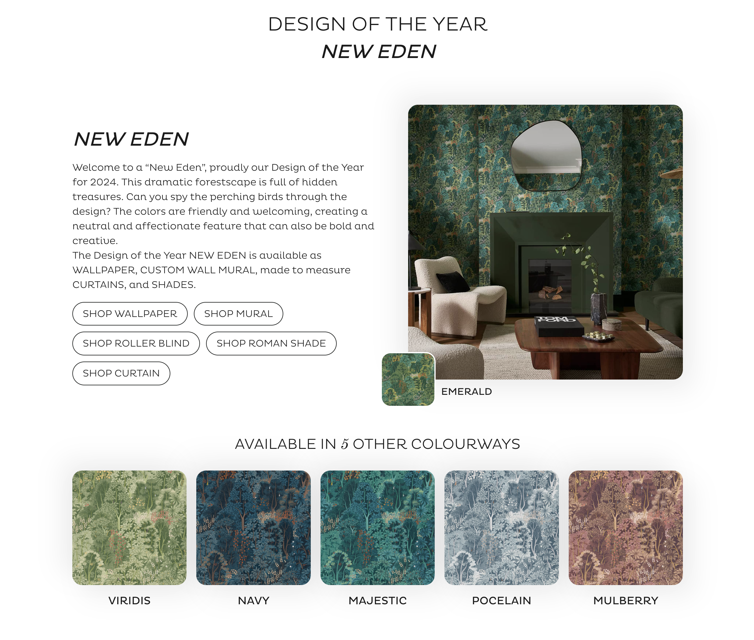
Graham and Brown marks a decade of design this year with the new design New Eden and their new color pick Veridis. Their aim was to create a utopian vibe blurring the boundaries of what a room should be. This color welcomes in the outside with shades of deep rich greens and plant-based colors.
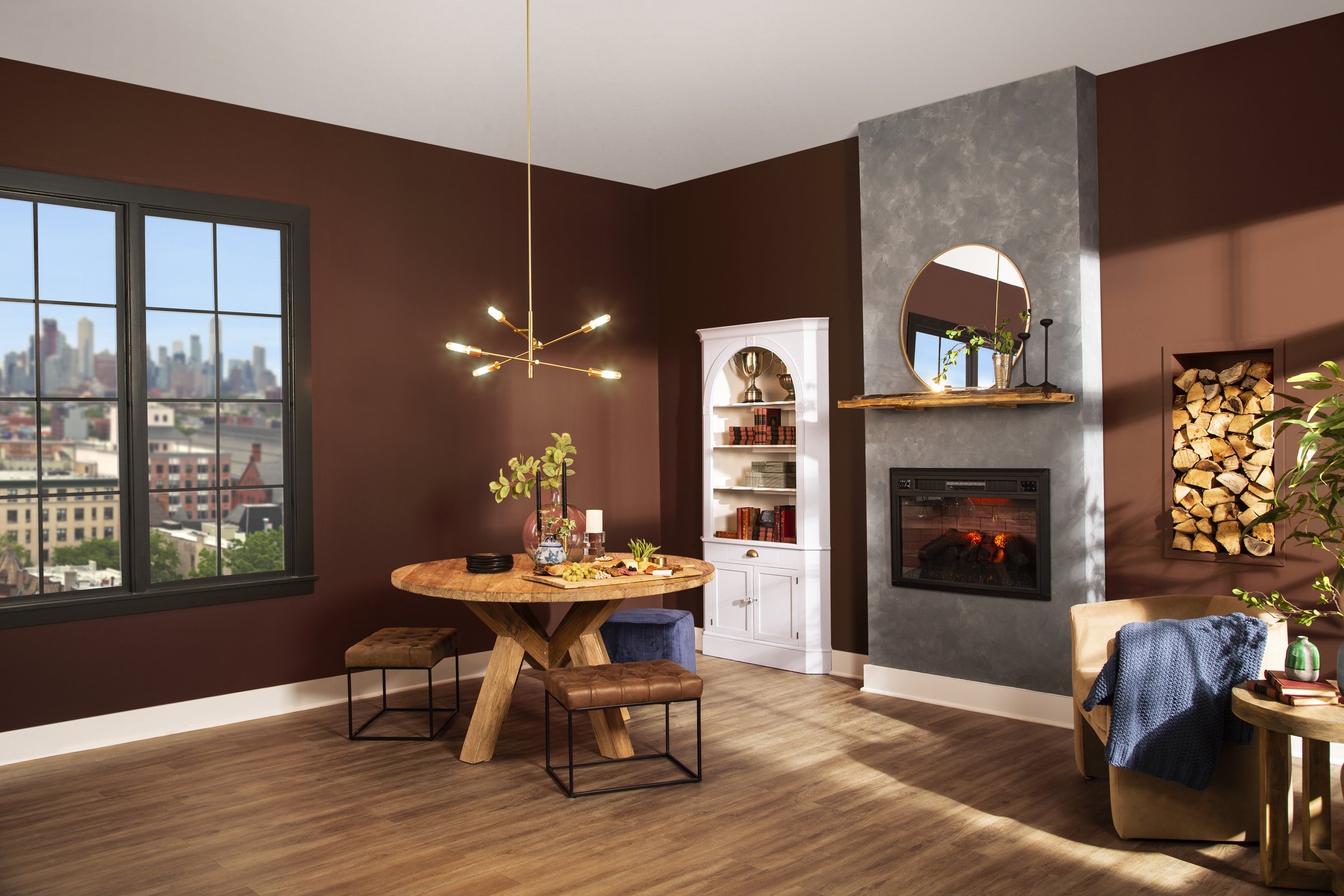
Rust-oleum unveiled their color of the year pick and the name alone makes my mouth water. Chocolate Cherry is a chocolate brown hue with a hint of red. It is rich and inviting with an air of warmth that will complement any space. The potential color pairings are endless as this shade seems to look good with absolutely everything!
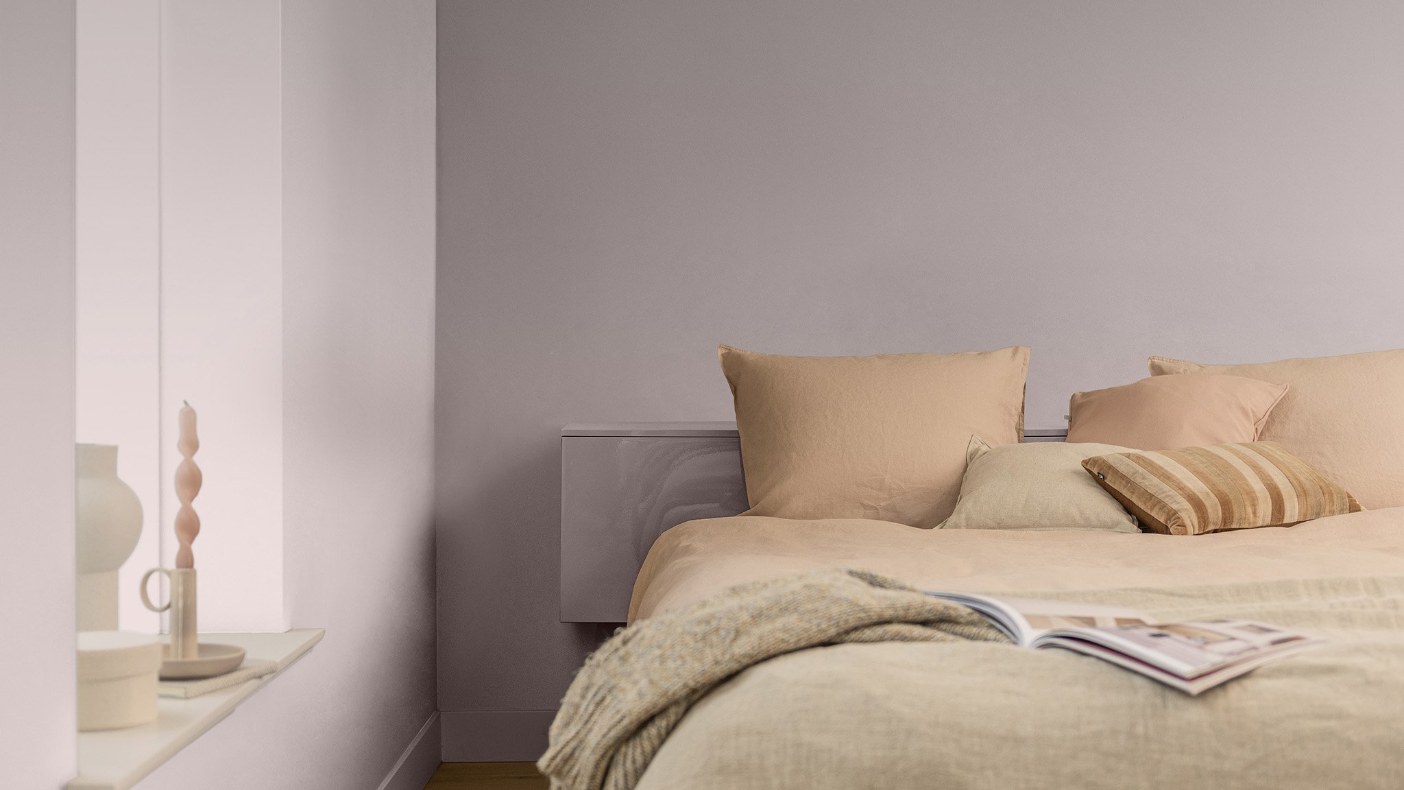
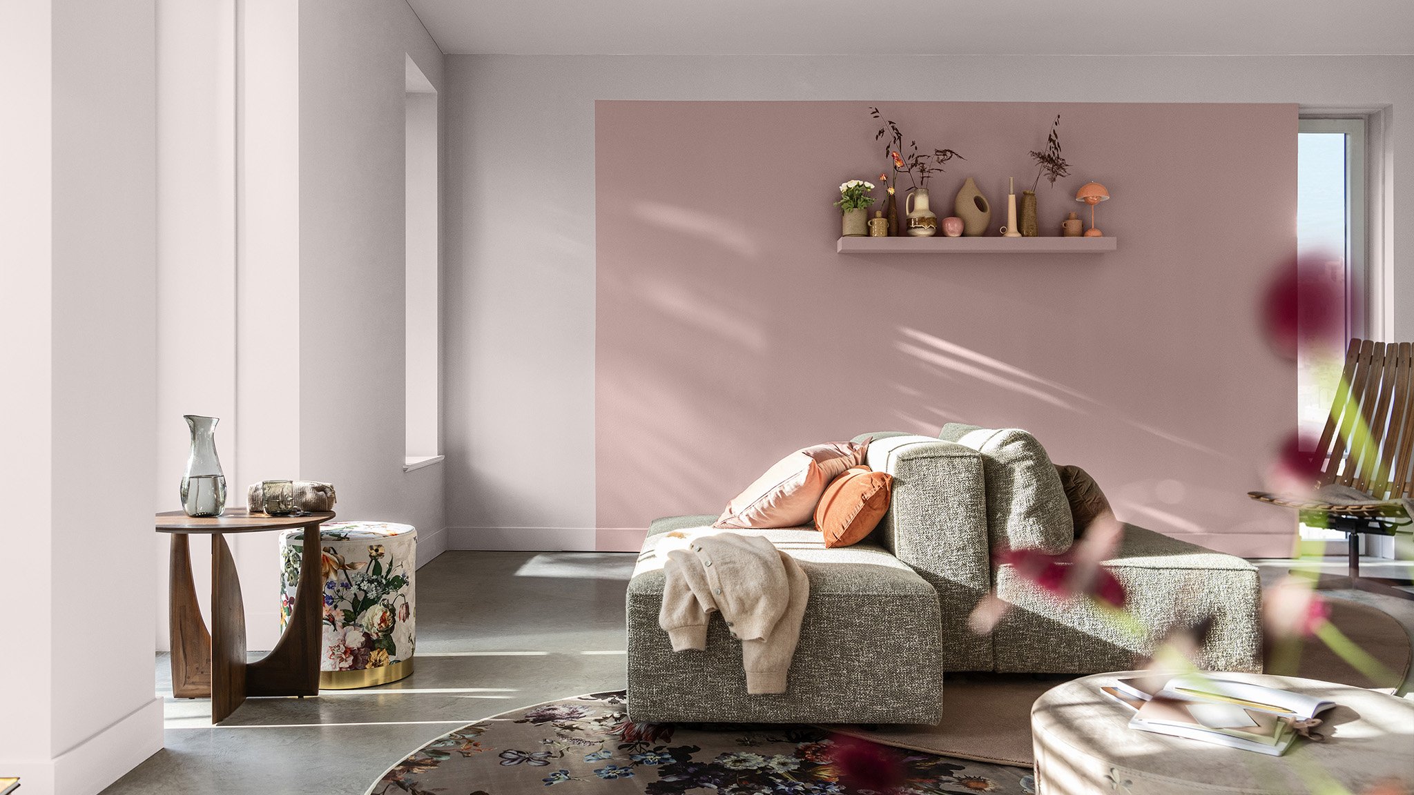
Last but not least, Dulux came in with a sweet and peaceful shade called Sweet Embrace that perfectly balances pink and purple to accommodate any taste. The palette is a stunning mix of calm and bold earth tones that complement the lavender shade creating a peaceful and joyful environment in any room it touches.
Pantone came out this week with their pick called PANTONE 13-1023 Peach Fuzz which “…captures our desire to nurture ourselves and others. It’s a velvety gentle peach tone whose all-embracing spirit enriches mind, body, and soul.” This peachy tone is quite similar to the fashion color pick they selected earlier in the year. It evokes a sense of peace and serenity laying out in the sunlight on a cool spring day.

That’s a wrap! The 2024 list is hot off the presses and ready for you to embrace and explore. Be sure to check out these brands and see how you can incorporate the new color picks into your current décor! Selling your home? Talk to a Realtor before picking your repaint color choice to find a color that will be appealing to the most buyers! Buying a home? Use these colors and check out our other tips and tricks to inspire your design choices!
Try any of these 2024 colors of the year and post the photos below in the comments! At The O’Gorman Group - Buying and Selling is our specialty so give us a call today and see what additional value Cindy and her team offer over the competition. Oh, and by the way, Welcome Home! 🏡